Learning R and Shiny using the public perm labor data has given me a chance to peak into the real world challenges of data curation and wrangling.
Often there is a need to determine, how a certain measure ranked periodically (yearly or monthly etc.). In perm data, the employee’s country of origin is tracked. This gives a chance for some interesting analysis.
For e.g., Which foreign country accounts for the most perm labor certifications year over year?
Calculating the frequency of the country of citizenship to the number of applicants per year can be done using the frequency table function.
The raw data is of the format:
| Company_Name | Job_Title | Salary | Country_of_Citizenship | Year |
|---|---|---|---|---|
| …. | …. | …. | INDIA | 2014 |
| …. | …. | …. | CHINA | 2014 |
| …. | …. | …. | SINGAPORE | 2014 |
| …. | …. | …. | ZIMBABWE | 2013 |
| …. | …. | …. | INDIA | 2013 |
| …. | …. | …. | CHINA | 2013 |
| …. | …. | …. | SUDAN | 2012 |
| …. | …. | …. | …. | …. |
By using the table function, we can determine the frequency of the country per year.
Country_table<- table(perm_data$Country_of_Citizenship, perm_data$Year)By converting the table to a data frame and renaming the columns, I arrived at the following data frame.
| Country | Year | Count |
|---|---|---|
| INDIA | 2014 | 35099 |
| CHINA | 2014 | 5098 |
| SINGAPORE | 2014 | 321 |
| ZIMBABWE | 2013 | 25 |
| INDIA | 2013 | 28765 |
| CHINA | 2013 | 6756 |
| …. | …. | …. |
I used the following functions to determine the rank of the countries at a certain year. i.e., the country that had the highest count for the year 2014 will be ranked as 1 for 2014.
- rank(x) – determines of the rank of the vector x
> vec<-c(49,35,75,109,26,555,24,555,799,56)
> rank(vec, ties.method="first")
[1]  4  3  6  7  2  8  1  9 10  5
The ties.method specifies the logic to use when there are ties in the ranking, in this case, the first appearance will take the lower rank.
- ave(x, …, FUN = mean) - Subsets of x[] are averaged, where each subset consist of those observations with the same factor levels
For my use case, I did the following:
ave(Count, Year, FUN = function(x) rank(-x, ties.method = "first"))The above function, applies the “rank” function grouped by Year, on the Count vector.
Finally, I used the transform function to include a new column “Year.rank” to the data frame to obtain the ranks of the country for a particular year.
transform(my_country_count,
                Year.rank = ave(Count, Year,
                        FUN = function(x) rank(-x, ties.method = "first")))
The –x is used to give the lowest rank to the highest count.
The final data frame with ranks looks like this:
| Country | Year | Count | Year.rank |
|---|---|---|---|
| INDIA | 2014 | 35099 | 1 |
| CHINA | 2014 | 5098 | 2 |
| SINGAPORE | 2014 | 321 | 98 |
| ZIMBABWE | 2013 | 25 | 150 |
| INDIA | 2013 | 28765 | 1 |
| CHINA | 2013 | 6756 | 2 |
| …. | …. | …. | …. |
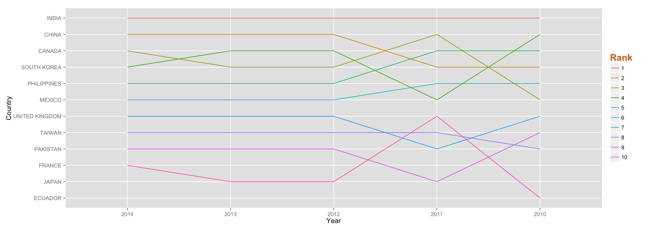
Using the above data frame, a subsetted top 10 or 20 is used for a line plot. I used ggplot to arrive at the following graph:
ggplot(top_10, aes(Year, Country, group= Year.rank, colour =factor(Year.rank))) +
  geom_line(position="dodge",stat="identity") + theme(legend.title=element_blank())
The final plot looks like this:
Fork the code at Github

