
R provides powerful ways to visualize data.
In my use case, I needed to represent mean salaries vs titles or mean salaries vs companies.
I used the “barplot” initially to represent a bargraph. As I explored the R language further, I realized that the ggplot is used a lot for data visualization. I wondered why there was a need for two functions essentially to perform the same operation.
The data is of the format:
| Title | Mean_Salary |
|---|---|
| Accountants | 83000.00 |
| Actuaries | 117000.00 |
| Art Directors | 108000.00 |
| Biomedical Engineers | 98000.00 |
| Chief Executives | 145000.00 |
| Computer Programmers | 120000.00 |
| …. | …. |
| …. | …. |
| …. | …. |
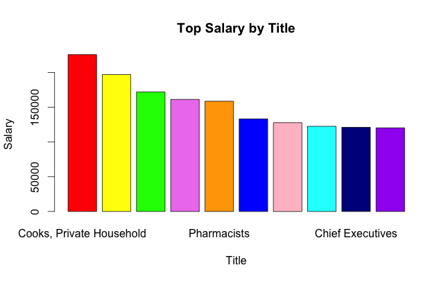
I wanted to sort the above data based on the descending value of the Salary and plot a bargraph of the top 10 Salaries.
I sorted the data frame to be the decreasing order of the Mean_Salary, this way I would get the top 10 salaries as the top 10 rows of the data frame.
sort.aggr_dataset<-aggr_dataset[with(aggr_dataset,
			order(Mean_Salary,decreasing=T,na.last=T)),]
The bar plot was constructed using the following command.
colors<- c("red", "yellow", "green", "violet",
		"orange", "blue", "pink", "cyan", "darkblue", "purple")

barplot(sort.aggr_dataset[1:10,2],
		names.arg=sort.aggr_dataset[1:10,1],
		xlab="Title",
		ylab="Salary",
		main="Top Salary by Title",
		border="black",
		col=colors)
In the barplot, the first value “height” determines the y-value and the names.arg determines the x-value. For purpose of similar looking graphs between barplot and ggplot, I have added the colors vector, which will give a colorful bar graph with 10 colored bars.
By doing this I got the following graph:
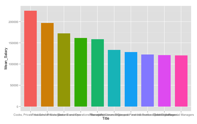
There was one additional step I did for the ggplot. In ggplot the order of the bars is determined by the order of the factors, so I further ordered the dataframe using the following command.
sort.aggr_datset_ord<-transform(sort.aggr_dataset,
					Title=factor(Title,levels=sort.aggr_dataset$Title))
I used the following command to construct a ggplot:
ggplot(sort.aggr_datset_ord[1:10,], aes(Title, Mean_Salary, fill=Title))
		+geom_bar(position="dodge", stat="identity", width=0.75)
		+theme(legend.position="none")
The first argument is the data frame for the plot is done. The “aes” determines the x value and the y value, in this case, Title and Mean_Salary being the x and y respectively. The Title was used for “fill”, which made sure that each of the bars got a different color.
Since we are constructing a bar chart, used the geom_bar with stat=”identity”. This is used when we want the height of the bar to represent the value of the data(and not the count). I did not want the legend in this case(as each color is representative of the title), so hid it using the “theme”.
By doing this I got the following graph:
Both the above commands solve the same purpose, creating a barchart for the title vs Salary. However, while constructing, ggplot felt like a more flexible option, as it gave a lot of flexibility around the aesthetics of the plot, the colors, the labels, the positioning etc.
For a rudimentary and quick graph during exploratory phase of analysis, barplot command seems to be a good option, however if the purpose of the graph is a better visualization, then ggplot provides more flexibility and options.
Fork the code at Github